17 - Tutorial: plot graphs using R
Hi crew,
Ready for a new post?
Today, as I promised, I want to introduce you to plot graphs using R.
R is a software that offers a large variety of solutions for plotting beautiful and fully customizable graphs and is the software that I use for my data analysis in my project.
Let’s start then this brief tutorial. The dataset I will use is actually completely random, but of course, you can use any other you want.
#this is a comment in R
#let’s start assigning values to our ‘x’ and ‘y’
Data <- data.frame("X" = c(0.25, 1.85, 2.35, 2.76, 3.85, 4.55, 5.25, 6, 6.25, 7, 8.25), "Y" = c(0.35, 1.95, 2.28, 2.68, 3.97, 4.5, 4.9, 5.85, 6.48, 7.01, 8.15))
Another way to do that can be:
x <- c(0.25, 1.85, 2.35, 2.76, 3.85, 4.55, 5.25, 6, 6.25, 7, 8.25) # assigns a vector to the variable ‘X’
y <- c(0.35, 1.95, 2.28, 2.68, 3.97, 4.5, 4.9, 5.85, 6.48, 7.01, 8.15) # assigns a vector to the variable ‘Y’
Data <- data.frame("X" = x, "Y" = y) #create data.frame
Or, alternatively, you can extract your own data from csv or excel files using the read.csv() or read_excel() (from package readxl) functions. Also, in this case, the resulting database will be extracted in the data.frame format. No worries, if you are not familiar with it, just know that a ‘data.frame’ in R is just the way you call a table, a matrix, etc. It is basically the equivalent of a matrix or an Excel spreadsheet.
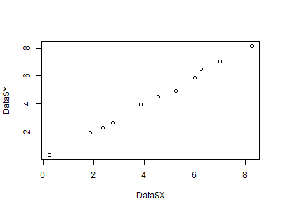
Then, let’s plot our first graph in R:
plot(Data$X, Data$Y)
 |
| Fig 1 - Our first plot created using R |
And here we go. We have our first plot. I mean, you are right, it is quite ugly to be honest but, still, it is done. However, as I promised, by the end of this tutorial we will be able to plot awesome plots. This is just the basic. To improve that, we just need to add some more lines of code.
Let’s try, for example, to add some color, customize the labels on the axis and the title, add a trendline, and add the legend:
plot(Data$X, Data$Y, main = "My first plot in R", xlab = "X-axis", ylab = "Y-axis", col = "blue", pch = 19, xlim = c(0, 8), ylim = c(0, 8))
abline(0, 1, col = "red", lwd = 1.5) # add a red line with intercept 0 and slope 1, lwd sets the thickness
grid(nx = NULL, ny = NULL, col = "lightgray", lwd = 1) # add grid
legend(5.5, 2.75, c("points", "trendline"), pch = c(19, NA), lty = c(NA, 1), lwd = c(NA, 1.5), col = c("blue", "red")) # add legend
 |
| Fig 2 - Our first customized plot created using R |
That’s cool, isn’t it?
How to save this as a png file?
png("My first plot in R.png", 400, 300) #specify file name, width and height of the plot (in pixles)
#put here the code of your beautiful graph
dev.off() #finally save and close the picture
Of course, more options are available and you can basically customize each single part of your graph. Here you can find more information about all options available:
Each option in R refers exactly to a single part of the plot and different options correspond to different layouts.
A package is worth to have a look at if you would like to have even more options and even more customizable plots in R is ‘ggplot2’. This is really an amazing package which gives you the possibility to take control of your graphs in full. I suggest you have a look at it if you think a simple ‘plot’ function may not be enough for you. The concept behind it is the same. A plot is the overlap of multiple layers. You can find more information about it here: http://ggplot2.org/.
Do you wonder how can you plot a histogram?
Basic is:
hist(Data$X)
Nice? Not really right?
What about this one instead?
hist(Data$X, main = "My first histogram in R", xlab = "X-axis", col = "lightblue", breaks = 5) #the option 'breaks' specifies the number of columns of the histogram
 |
| Fig 3 - Our first histogram created using R |
But, also in this case, much more can be added and customized. I suggest you visit websites like: https://www.r-bloggers.com/ or https://www.r-statistics.com/ for more information.
And that’s all for me at the moment. Please, leave in the comments your doubts or suggestions and I will answer to you as soon as possible. In my next post, I will tell you more about the ESREL Conference! Yes, crew, it is my pleasure to announce that another publication will be released shortly!
Do you want to know more about it?
Just stay tuned then! Soon I will release a post about that.
Cheers,
FP13


Why anyone use R for the plotting?
ReplyDeleteHi, thank you for the comment. In my case, I use R because I'm using it for Statistics and data analysis also. Therefore it is convenient (for me) knowing how to plot graphs using R. However, in my short career I coded also using other software like Matlab-Simulink or Python and all of them offer the possibility for the user to plot very nice and fully-customizable plots (and this is something that most of the time Microsoft Excel does not allow). R also has the advantage of being freeware and offers thousands of open-source libraries developed by thousands researchers/statisticians all over the world. It is very flexible. Also, if used in combination with R Studio it offers a nice and user-friendly interface (very similar to Matlab). I hope this clarifies your doubts, but please, feel free of asking more questions if anything is still not clear.
ReplyDelete